
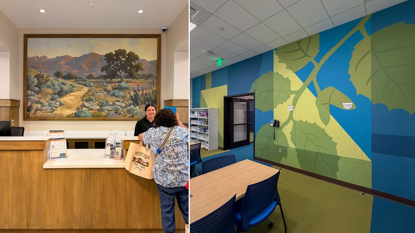
When the new 13,000-square-foot Irwindale Library opened in August 2026, it wasn't simply a new home for books. It was designed as a community resource dedicated to education, lifelong learning, technology, gathering and discovery.
Original artwork by local artists was an important part of creating a library that felt distinctly connected to Irwindale.
Our team at Hattas Studios was commissioned to create two site-specific murals: a large painterly landscape behind the Reference Desk, and a bold graphic mural for the Learning Center.
While the two murals couldn't be more different in style—one a painterly California landscape and the other a bold, graphic environment—they share a common element: the oak tree.
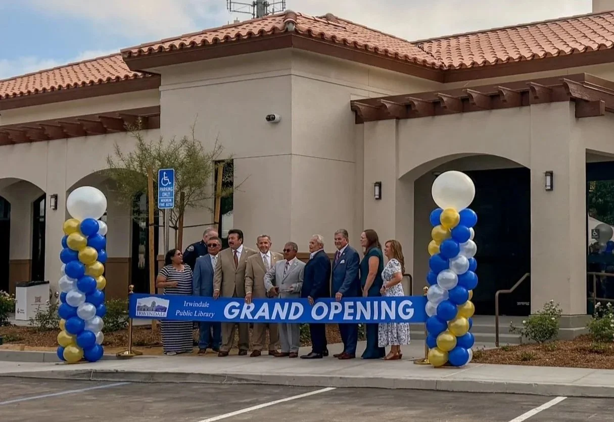
Presenters and honored guests at the Irwindale Public Library included Mayor H. Manuel Ortiz ; Councilmembers Albert F. Ambriz, Mark A. Breceda, Larry G. Burrola, and Manuel R. Garcia; Congressman Gil Cisneros; State Senator Susan Rubio @sensusanrubio ; Assemblywoman Blanca E. Rubio @asmblancarubio ; California State Library representative Natalie Cole; LA County Supervisor Hilda Solis; and the Irwindale Police Department Honor Guard.
1. The Challenge
Working with art consultant MaryLinda Moss of Source Art, interior designer Rachel Duarte of Rachel Duarte Design Studio, and City Librarian Shayna Balli, Hattas Studios was tasked with developing two original murals for two very different areas of the new Irwindale Library.
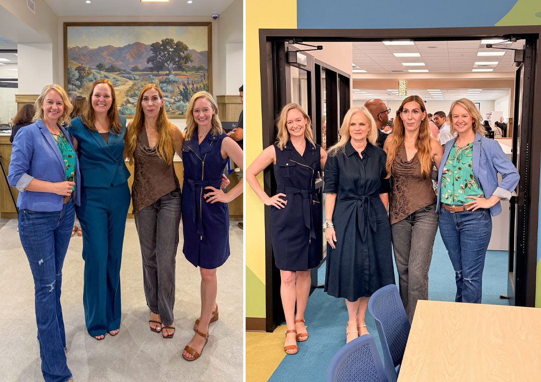
LEFT IMAGE (left to right): Jeanine Hattas Wilson (CEO and Creative Director at Hattas Studios), Shayna Balli (City Librarian), Bettina Steinmann (Associate Art Consultant at Source Art), (not pictured MaryLinda Moss, Lead Consultant and Founder at Source Art), Julie Kennedy (Art Director at Hattas Studios)
RIGHT IMAGE (left tor right): Jeanine Hattas Wilson (CEO and Creative Director at Hattas Studios), Rachel Duarte (Interior Designer at Rachel Duarte Design Studio), Bettina Steinmann (Associate Art Consultant at Source Art), (not pictured MaryLinda Moss, Lead Consultant and Founder at Source Art), Julie Kennedy (Art Director at Hattas Studios)
The creative brief went beyond simply filling two large walls.
The artwork needed to:
Feel specific to Irwindale and its community
Connect to the architecture and interior design of the new library
Establish a visual relationship between two very different spaces
Celebrate the local landscape without feeling generic or overly literal
Create an impactful focal point at the Reference Desk
Bring energy and imagination into the Learning Center without making the room feel visually overwhelming
Become an enduring part of a civic space intended to serve generations of residents
The challenge was ultimately this:
How do you create two murals with completely different visual languages that still feel like chapters of the same story?
2. Finding the Story
The inspiration for the both murals came from the site itself.
During construction of the new library, two existing oak trees had to be removed. Rather than allowing that piece of the landscape to disappear, the wood was salvaged and incorporated into the new library—including the frame surrounding the Reference Desk mural.
That gave the design team the thread it needed.
The oak could become a symbol connecting the landscape that existed before the library, with the new community space taking its place.
From there, we looked more closely at the natural environment of Irwindale, researching indigenous and locally appropriate plant life that could help make the artwork feel rooted in this particular place.
We worked with City Librarian Shayna Balli to help ensure that the landscape imagery reflected Irwindale rather than becoming a generalized vision of Southern California.
The oak became the common story.
How we told that story, however, would change dramatically from one room to the next.
3. Mural One: The Reference Desk Painterly Landscape
PURPOSE
The architecture gave this mural an important job before we ever put paint on the wall.
Visitors entering the library are greeted by a long corridor with a direct sightline toward the Reference Desk. The wall behind it naturally becomes a destination—an opportunity to draw visitors through the space and create a memorable first impression.
The goal was to have the artwork reward that sightline.
DESIGN DIRECTION
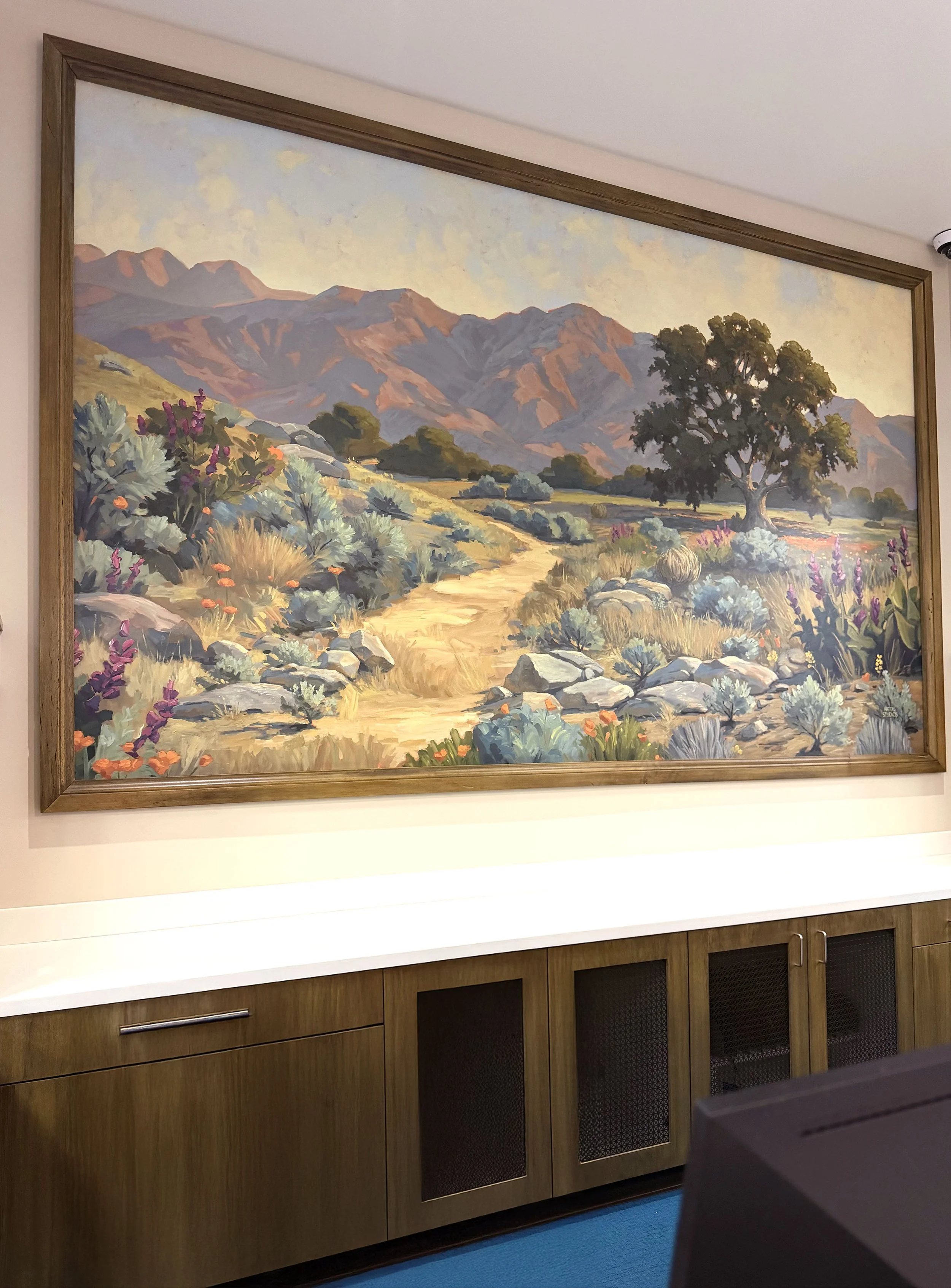
For this mural, we turned to the tradition of California plein air landscape painting.
Loose brushwork, layered color, atmospheric depth, and a painterly approach gave the mural a sense of history and permanence that felt appropriate for a civic space.
Rather than feeling like a graphic applied to the architecture, the finished mural feels almost like an enormous landscape painting embedded within it.
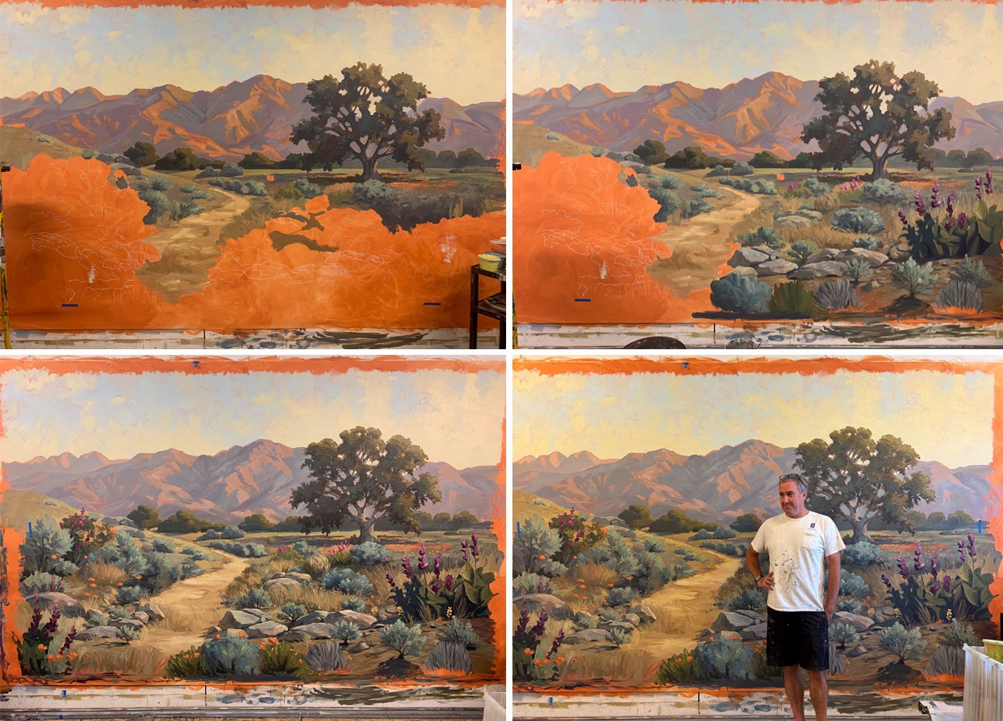
Irwindale landscape mural in progress at Hattas Studios’ painting studio, with lead artist Ian Burgess.
STORY
At the center of the composition is a large oak tree surrounded by plants and rocks representative of the Irwindale landscape.
The scene isn't intended to document one exact location. Instead, it brings together recognizable elements of the area's natural environment to create a landscape that feels unmistakably rooted in place.
The oak becomes the anchor of the composition—both visually and symbolically.
CONNECTION TO IRWINDALE
A beautiful California landscape alone wasn't enough.
We wanted visitors to recognize something of their landscape in the mural.
Research into local plant life helped shape the scene, while collaboration with the library team and supporting committee helped ensure the imagery felt appropriate and authentic to Irwindale.
The result is not simply "nature."
It's a portrait of place.
CONNECTION TO THE OAK
The oak has an especially meaningful role here.
The painted tree references the oak trees removed during construction, while the actual wood from those trees was repurposed within the new library.
Most notably, salvaged oak surrounds the mural itself.
That creates a quiet but powerful connection: a painted oak representing the landscape is physically framed by wood from the trees that once grew on the site.
The old landscape quite literally becomes part of the new one.
WHY IT WORKS HERE
Scale was critical.
Because visitors first experience the mural from down a long corridor, the large tree creates a strong focal point from a distance. As visitors approach, the loose brushwork, layers of paint, and smaller landscape details reveal themselves.
The composition gives the eye somewhere to travel, while the organic shapes provide a counterpoint to the clean architectural lines of the library.
Most importantly, the mural gives the Reference Desk a sense of place and significance.
It isn't simply a desk at the end of a hallway.
It becomes a destination.
4. Mural Two: The Learning Center Graphic Leaves Mural
PURPOSE
The Learning Center required an entirely different solution.
This is an active space intended for learning, exploration and engagement. The artwork could be playful and energetic, but the design team was also conscious that a highly stimulating mural could compete with the activities happening within the room.
We wanted to find a balance:
How could we create something fun and memorable while also giving the eye places to rest?
DESIGN DIRECTION
This time, we didn't begin with the wall.
We began with the floor.
The Learning Center flooring already featured bold blue and green rectangular forms. Instead of introducing an unrelated visual language, we extended that existing design upward.
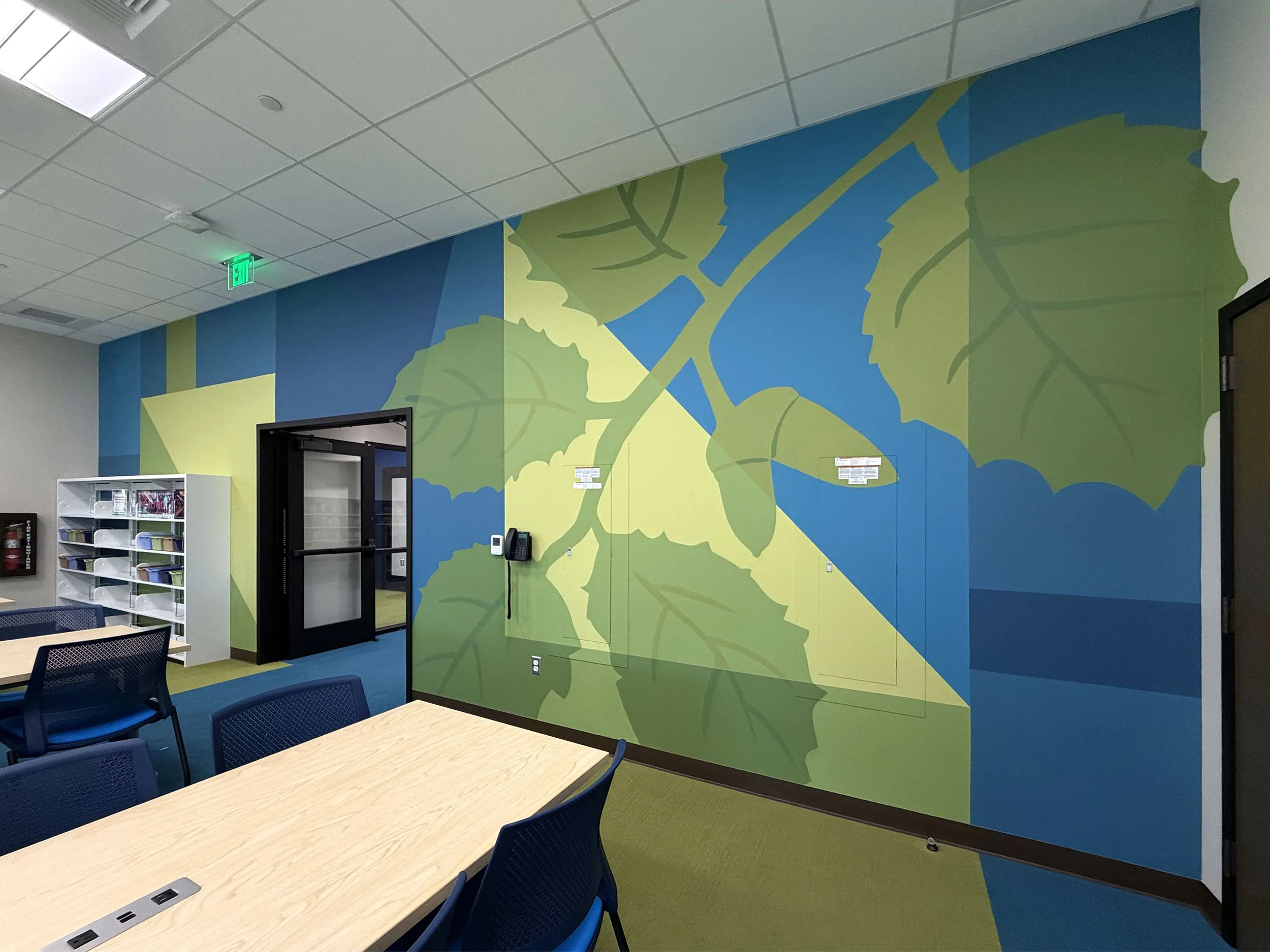
Large blue and green geometric shapes appear to travel directly from the floor onto the walls, creating a continuous visual environment.
The mural doesn't feel like artwork that was added to the room.
It feels integrated into the architecture.
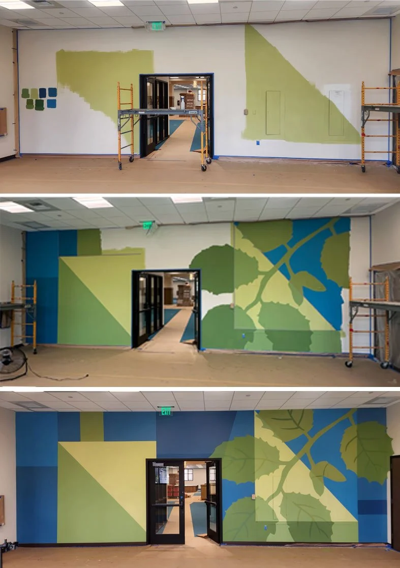
Irwindale Library Learning Center hand-painted mural in progress.
STORY
Within those graphic forms, the oak story returns—but in an entirely different way.
Instead of a realistically painted tree, a simplified oak branch, leaves and acorns become graphic elements within the composition.
Early in the design process, we explored more separated, floating leaf forms. But the composition began to feel too visually disconnected and ungrounded for the experience we wanted to create.
Connecting the leaves to a branch gave the imagery a stronger visual anchor.
The branch became the primary organic focal point, while the larger solid shapes provided areas of relative visual structure around it.
CONNECTION TO IRWINDALE
Although the mural feels contemporary and playful, its imagery still comes directly from the same local story as the Reference Desk mural.
Oak leaves and acorns bring the landscape of Irwindale into the room without repeating the literal landscape scene used elsewhere in the library.
It's the same source material, translated into a completely different visual language.
CONNECTION TO THE OAK
Here, the oak isn't depicted as a monumental tree.
We zoomed in.
The branch, leaves, and acorns allow visitors to experience the oak at a more intimate scale—almost as though we're examining one small piece of the larger tree depicted elsewhere in the library.
That shift felt particularly appropriate for a room centered around learning and discovery.
DESIGNING WITH VISUAL STIMULATION IN MIND
One of our important considerations for the Learning Center was creating visual interest without introducing unnecessary visual overload, particularly for visitors who may be more sensitive to highly stimulating environments.
That influenced several design decisions.
Rather than filling every surface with small details, we used large, solid shapes and a restrained color palette that create clear visual structure and places for the eye to rest.
The evolution from disconnected leaves to a grounded branch was important for the same reason. Connecting those elements established hierarchy and gave the composition a clear focal point rather than asking the eye to continually jump between unrelated objects.
The final mural still feels playful.
But the playfulness comes from scale, shape, and the unexpected continuation of the floor onto the walls—not from adding more and more visual information.
WHY IT WORKS HERE
The mural borrows its colors and geometry directly from the interior design, making the room feel more cohesive rather than more decorated.
Large areas of blue and green carry enough visual weight to hold the space, while the oak branch introduces movement and organic form.
The limited palette keeps the composition controlled.
And because the design crosses the perceived boundary between floor and wall, the mural creates an immersive experience without needing to cover every available surface with imagery.
5. Two Styles, One Story
Place the two murals side by side and they barely look like they came from the same project.
That's intentional.
One is painterly, atmospheric, detailed, and rooted in the tradition of California landscape painting.
The other is graphic, simplified, bold, and contemporary.
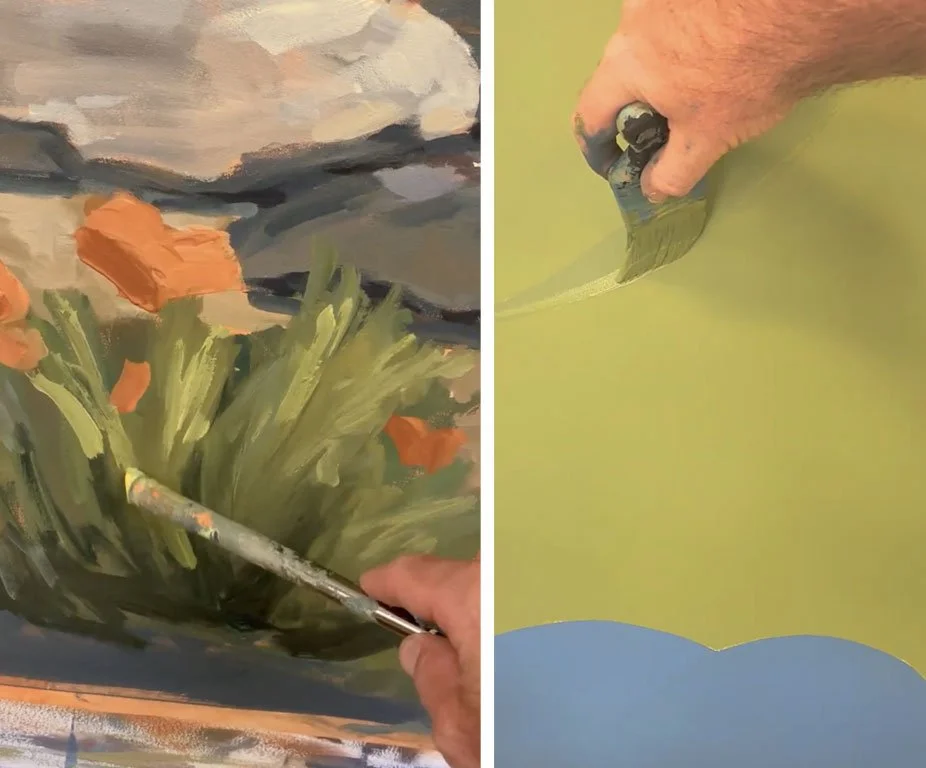
LEFT: Close up of plein-air style landscape over Reference Desk
RIGHT: Close up of graphic style mural in Learning Center
But good site-specific art doesn't require every piece in a building to look the same.
It requires each piece to belong where it lives.
The Reference Desk called for a visual destination—something visitors could see from across the library that carried a sense of permanence and place.
The Learning Center called for something energetic and integrated, but controlled enough to support rather than compete with the activities happening within the room.
So instead of forcing one aesthetic across both spaces, we connected the murals through story rather than style.
The oak is monumental in one.
Intimate in the other.
Painterly in one.
Graphic in the other.
Together, they tell the same story in two different voices.
6. The Finished Result: Artwork That Belongs to Its Place
The success of these murals isn't simply that they fill two walls in the Irwindale Library.
It's that they couldn't belong anywhere else.
The oak trees that once stood on the site inspired the imagery. Their salvaged wood became part of the new building. Irwindale's local landscape informed the plants. The architecture determined the scale and composition. The interior design influenced the colors and visual language. And the purpose of each room shaped how its mural needed to feel.
Every decision brought us back to the same question:
What belongs here?
The answer was different for each wall.
But together, the two murals contribute to a library filled with original artwork that feels uniquely connected to the people and place it serves.
For a building dedicated to preserving knowledge, encouraging discovery, and investing in future generations, there is something fitting about carrying a piece of the landscape's past into its future.
That's what site-specific art can do at its best.
It doesn't simply decorate a space.
It gives the space a story that belongs to it.
Looking for Custom Murals or Site-Specific Artwork?
Hattas Studios collaborates with interior designers, architects, art consultants, developers and public organizations to create custom murals and site-specific artwork for libraries, hospitality spaces, workplaces, healthcare environments, residential projects and public spaces throughout Los Angeles, Southern California and beyond.
From painterly landscapes to large-scale graphic murals, each piece is designed specifically for the architecture, audience and story of the space.
Have a wall that could tell a story? Let's create something that belongs there.
Subscribe to the Hattas Studios Newsletter
Sign up to receive art tips, inspiration, behind-the-scenes stories, and special promotions right in your inbox.